I currently have a reporting requirement to develop a data quality report showing weekly results for different business processes. The weekly results need to be displayed in separate columns for each week, with rows representing the business processes. This would be a simple enough task in MS Excel using pivot tables, unfortunately these are not available in Web Intelligence reports. The next best option is to use the cross table, which this post will describe.
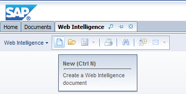
Begin by launching the Web Intelligence application.
Click the the New button (or press Ctrl + N) to create a new Webi document.
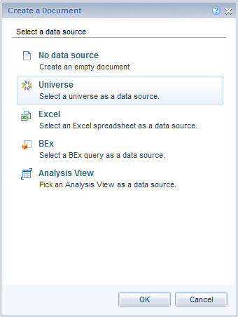
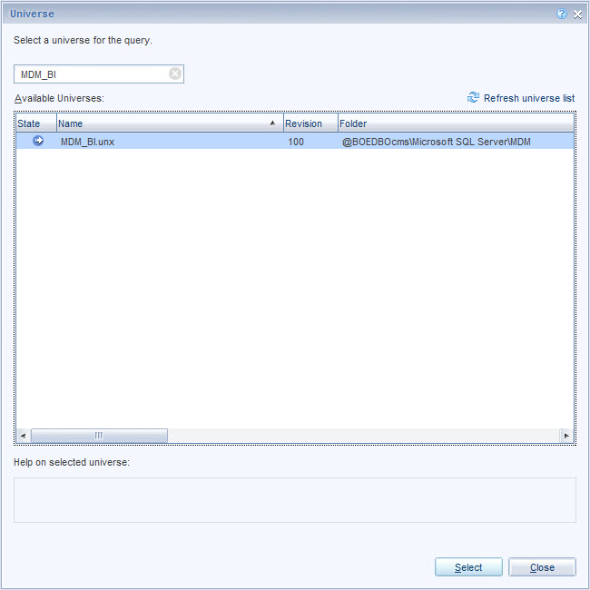
Select the the necessary data source and click the OK button. For my report the data resided in the MDM_BI universe.
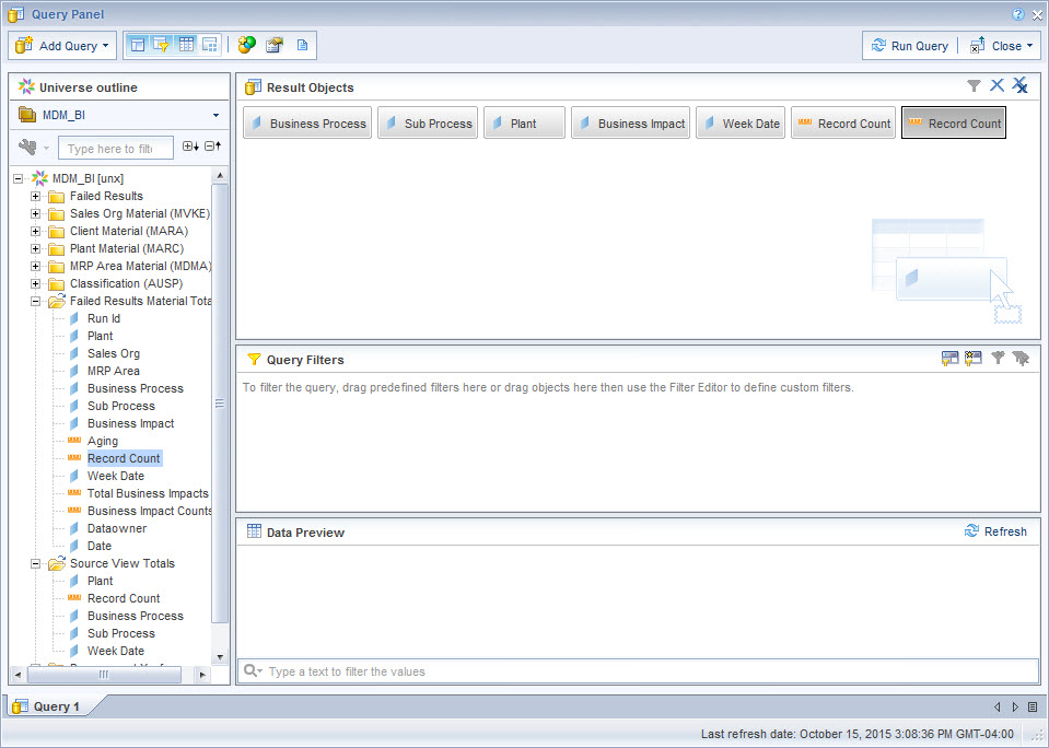
Next we build the query. For my scenario I needed to include five dimensions and two measures from two separate tables.
- Business Process
- Sub Process
- Plant
- Business Impact (this will be used in filtering and won’t actually appear in the table)
- Week Date
- Record Counts (Total records and failed records)
Once the objects have been selected click the Run Query button to generate the data in the Webi document.
The data will appear in a regular table.
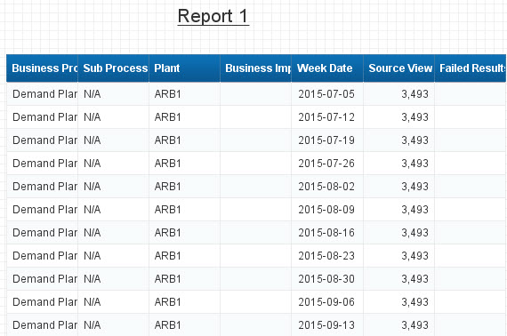
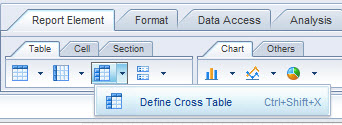
You could convert this table into a Cross Table, but its easier to start from scratch. Select the existing table and press the Delete key. Click the Report Element tab and click the Cross Table button and then click anywhere in the report.

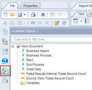
Next click the Available Objects button in the toolbar on the left side of the screen. From here we can drag the dimensions into the horizontal and vertical areas in the cross table.
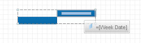
For my requirement I need the Week Date dimension to show up in separate columns. Drag the Week Date dimension for the Available Objects pane and drop it into the top right blue section in the cross table.
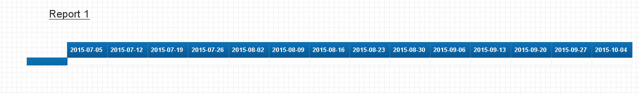
The dates will now show up in separate columns.
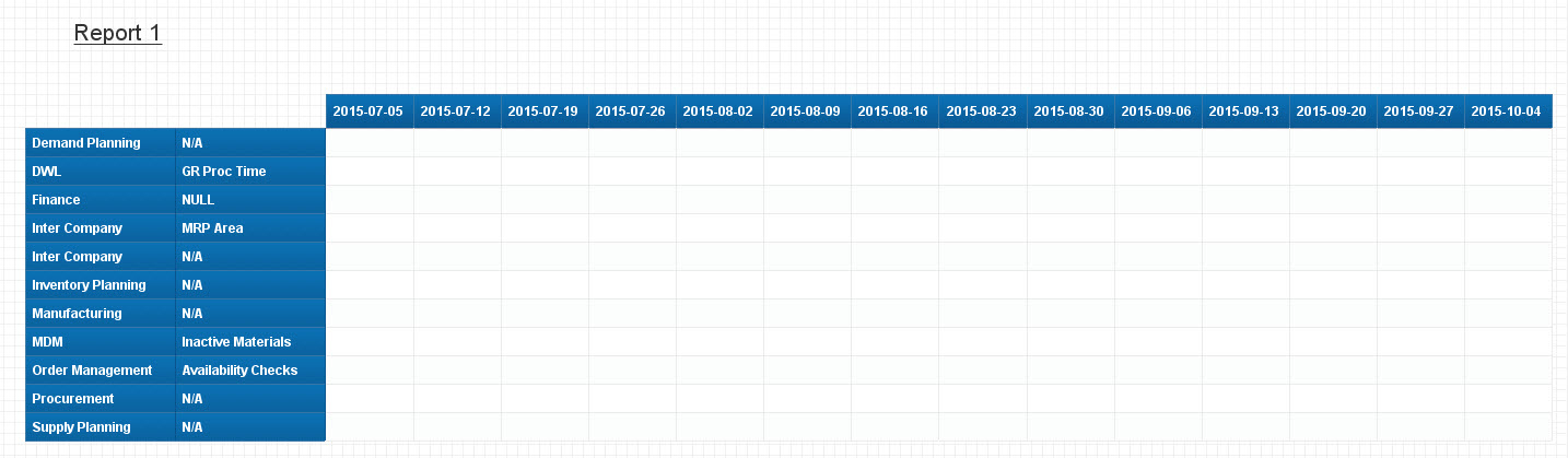
Next drag the Business Process and Sub Process dimensions into the blue section on the left of the cross table and resize the columns for a better appearance.
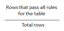
The next step is to develop a formula to calculate the data quality. The formula is relatively simple:
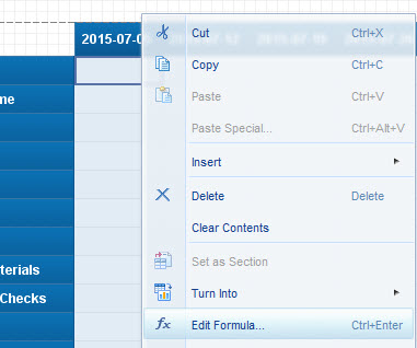
There are multiple ways to enter a formula but I typically prefer to use the Formula Editor. Right-click a cell in the table and select Edit Formula.
The Formula Editor window opens. The editor allows us to drag and drop the measures and validate the formula. Below is the formula I entered to calculate the data quality score.
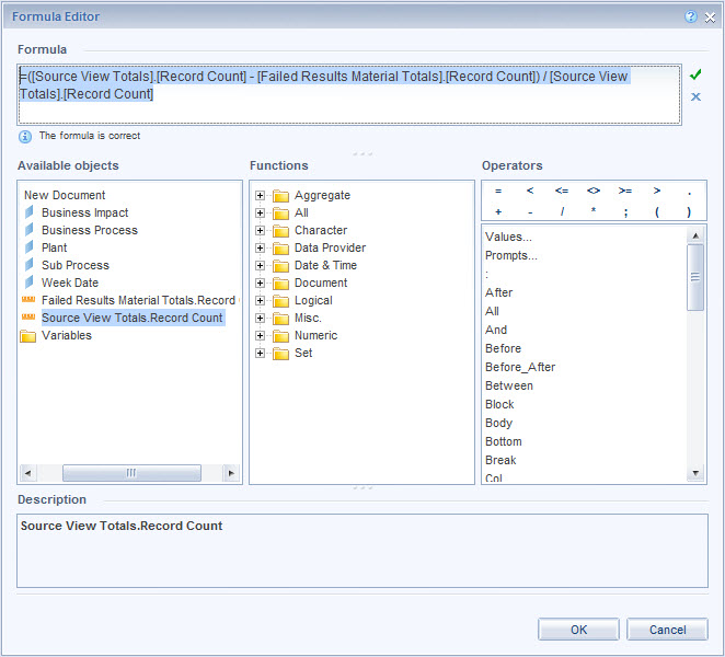
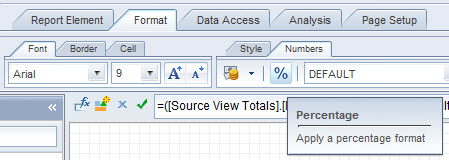
Once the formula checks out click the OK button. The next step is to clean up the formatting. Click any cell in the table and select the Format tab, then select the Numbers tab and click the Percentage button.
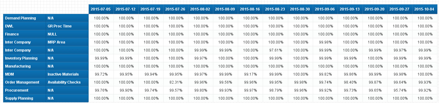
The results are a nice, clean, and concise table showing the data quality scores for the different business processes across several weeks. Simple.