I have been challenged to develop data quality dashboards using SAP’s Web Intelligence reporting tool. Those familiar with SAP Business Intelligence know there are more appropriate tools such as SAP BusinessObjects Dashboards, however to fulfill these specific requirements I have been limited to using Web Intelligence.
The main requirement is to use sparklines to show data quality score trends for different business areas for the past several weeks. Sparklines are simply small charts which fit into table cells alongside other information and show general trends. Unfortunately Web Intelligence does not provide this functionality and we will need to be creative.
Basically to create the impression of sparklines we are going to:
- Create a vertical table containing one dimension with different values – each value will represent an individual row
- We will use the Section feature to split the vertical table into individual tables, one table for each reach row for each unique dimension value
- Next we use a separate cross table with the same dimension as above, except this table will also include the time series data for the trends
- The cross table will be converted into a line chart and this chart will be dragged into the first section
- Now we will have each unique dimension value in its own section with its own line chart
- From here it’s a matter of formatting
It is a little confusing but I will show you how I accomplished it step by step below.
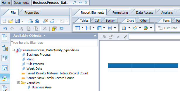
In this example the first step is to create a regular vertical table showing the data quality scores of different business areas. I began by creating a variable called Business Area which combined the Business Process and Sub Process dimensions together.
Next I created a new vertical table and dragged the Business Area variable into the first column and inserted the data quality score formula into the second column.
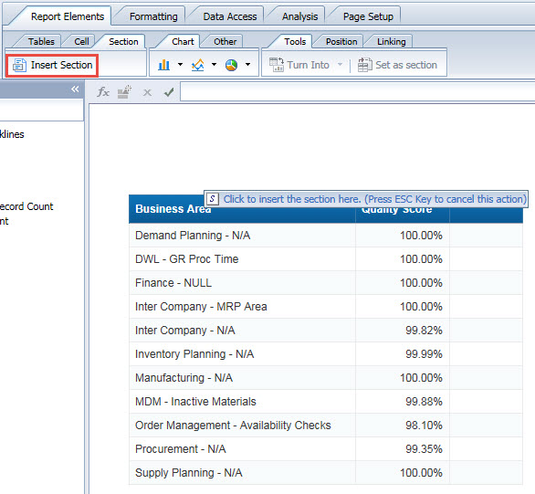
I gave the data quality score a column name and added percentage formatting. Below is the result so far.
This is where things get a bit tricky. The next step is to insert a new section for the Business Area variable. To do this select the Report Elements tab and select the Section tab and click the Insert Section button. Insert the section above the Business Area column.
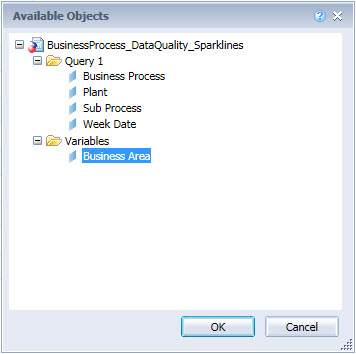
In the Available Objects window select the Business Area variable and click the OK button.
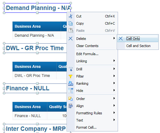
New sections will be created for each Business Area value.
The next step is to remove the large headers for the new sections. Right-click the new header and select Delete and Cell Only.
Delete the column header rows from the first table by right-clicking the column header and selecting Delete, Row, and click OK.
Now we need some actual trend data which we can show in a chart. In my report I created a separate cross table with the same Business Area variable with weekly data quality scores stored in columns. I have a previous post showing how you can create this relatively easily.
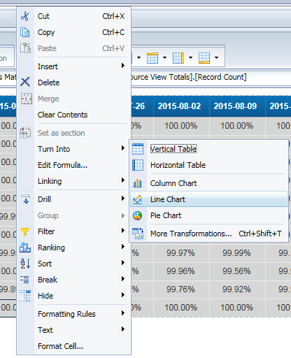
Next we will convert the new cross table into line charts by right-clicking the table and selecting Turn Into and selecting Line Chart.
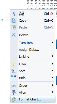
We will need to strip the chart clean so only the lines are showing. Right-click the chart and select Format Chart.
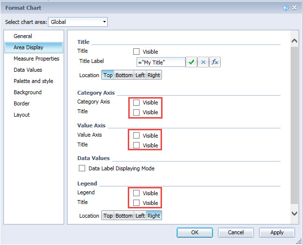
Navigate to the Global chart area and select the Area Display and then uncheck the Category Axis, Value Axis, and Legend check boxes.
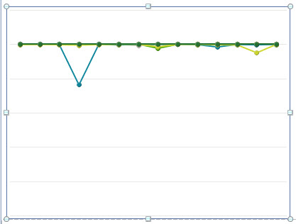
Only the lines should be remaining.
Now click on the chart and drag and drop it into the first section. Individual charts will now be available in each section.
Let’s fix the layout of the tables. Right-click the table and select Format Table and select Layout. Set the Position values to zero and click the OK button.
Now we need to shrink the size of the charts. Select the the lower left or right corner of the chart and drag it up to resize. After shrinking the first chart the results should look like something below.
From here you can format the table and charts for better appearance. Below are the steps I performed to reach the final appearance below.
- Increased the height of the table rows
- Made chart background transparent
- Changed thickness of line marks
- Changed minimum and maximum values
- Added conditional formatting for alternative row shading

